Is Europe Bigger Than Africa?
The comparison of size between the continents of Europe and Africa has been a debate for a long time due to misrepresentations in maps.
Size of Europe
Europe is the sixth largest continent, measuring about 4 million square miles or 10,180,000 square kilometers. This area accounts for about 2% of the earth’s surface area and 6.8% of the total land area of the planet. In comparison, this area is just a little bigger than the United States.
Size of Africa
Africa’s size, on the other hand, is 30,370,000 square kilometers (11,730,000 square miles). This figure makes Africa the second largest continent on Earth after Asia. Africa takes up about 6% of the earth’s total surface area and accounts for about 20% of the earth’s land area.
Which Is Bigger - Europe or Africa?
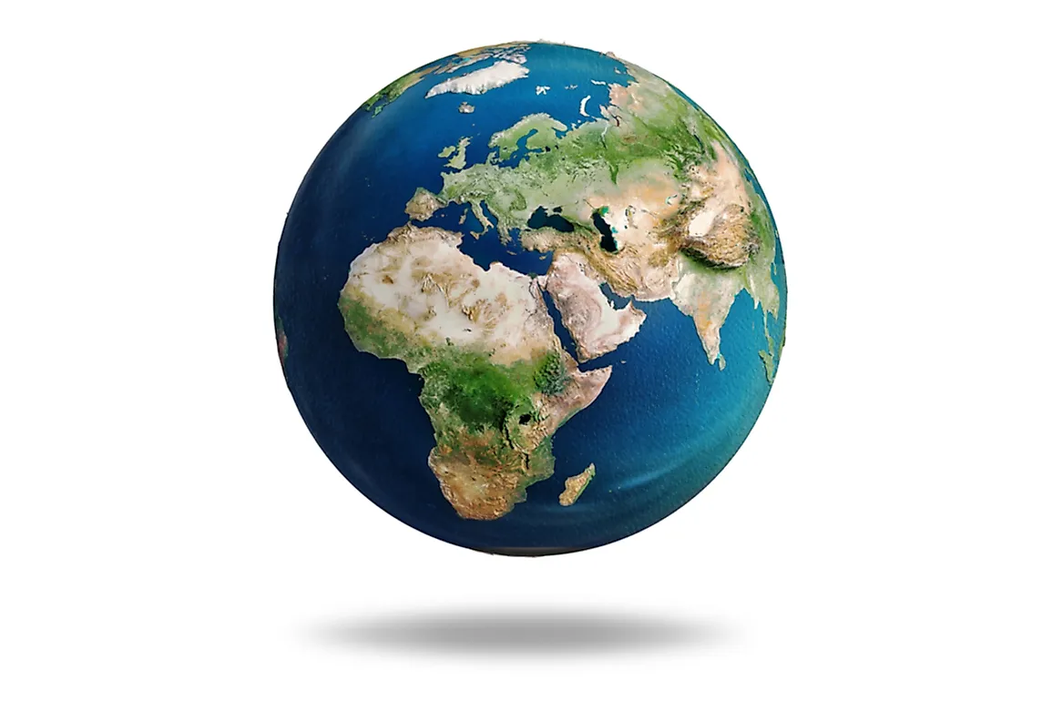
These figures show that Europe is actually about three times smaller than Africa. Despite this fact, Europe is still represented as being bigger on maps than Africa. This is because of a map representation method called the Mercator Projection, which was created by a Flemish cartographer by the name Gerardus Mercator. This map was very helpful to navigators but misguiding in other uses.
How Does The Mercator Projection Work?
The Mercator projection is a cylindrical projection that is arrived at mathematically. On this map's representation, meridians are drawn as parallel vertical lines, while latitudes are drawn as parallel horizontal lines. The spaces between the lines increase as they go farther from the equator.
The reason why this kind of projection is conducive for navigation is that any straight line plotted on the Mercator projection remains a true constant line of bearing throughout the map. This factor enables navigators to plan a straight line course easily.
The map representation was done on a globe, and transferring a spherical three-dimensional image to a one-dimensional surface was not easy. This kind of plotting distorts the size of areas on the map, with regions further away from the equator appearing to be bigger than they are whereas areas closer to the equator appear smaller than they are. This aspect brings about the difference between the actual size and map representation of Europe, Africa, and other regions on the map.
Solution To The Mercator’s Distortion
There have been several attempts to correct the bias that is caused by the Mercator Projection with no single solution being sufficiently accurate.
Arnos Peters came up with a map, The Peters Projection Map, that sought to show the world in an accurate equal area manner. The Peters projection map was discredited for lack of originality, as it greatly resembled a map devised in 1855 by the cartographer James Gall.
One R. Buckminster Fuller also came up with his representation of the earth and its continents . He called his projection the Dymaxion map. It shows the continent as adjoining landmasses or one big island. This is his trial to fit the globe to a flat map. His projection has been compared to that of Bernard J.S. Cahill. Cahill’s projection was done earlier than Fuller’s and is considered better.